Your sales page is the most important part of selling an online course. Even if your course is amazing, if your sales page doesn’t convert, you’ll lose potential students.
In this guide, you’ll learn:
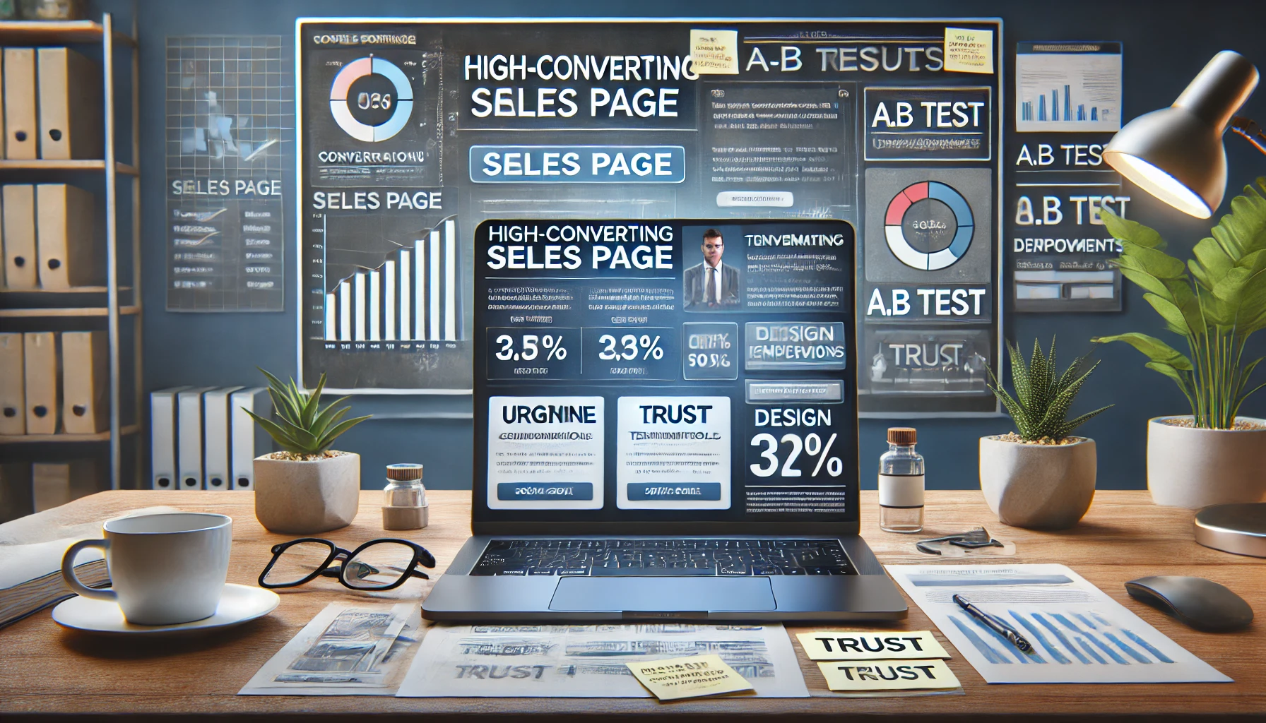
✅ What makes a high-converting sales page
✅ The exact structure to follow for maximum enrollments
✅ How to use social proof, urgency, and psychology to boost conversions
Let’s dive in! 🚀
Step 1: Understand What Makes a Sales Page Convert
A good sales page:
✔️ Grabs attention immediately (strong headline & visuals)
✔️ Clearly explains the benefits (not just features)
✔️ Builds trust (social proof, testimonials)
✔️ Overcomes objections (price, time, doubts)
✔️ Has a clear call to action (Enroll Now!)
❌ Biggest Mistakes That Kill Conversions:
- Confusing messaging (people don’t understand what they’re buying)
- Too much text (no one wants to read an essay)
- Weak CTA (not telling visitors what to do)
🔥 Pro Tip: Keep your sales page clear, simple, and focused on results.
Step 2: Follow This High-Converting Sales Page Structure
A winning sales page follows a proven structure that guides visitors step by step toward enrolling.
1️⃣ Attention-Grabbing Headline
Your headline should immediately capture interest and promise a clear result.
📌 Winning Headline Formula:
🔥 [Specific Outcome] Without [Common Obstacle]
✅ “Master Facebook Ads Without Wasting Money on Bad Campaigns”
✅ “Lose Weight Without Spending Hours in the Gym”
✅ “Start a Profitable Freelance Business Even If You Have No Experience”
🔥 Pro Tip: Use bold fonts and a simple, benefit-driven message.
2️⃣ Engaging Subheadline (Support the Headline)
✔️ Reinforce why your course is unique
✔️ Address a specific pain point or frustration
📌 Example:
🔥 “This step-by-step course will teach you how to [achieve goal] in just [timeframe]—without [pain point].”
✅ “A proven system to attract high-paying clients—even if you’re starting from scratch.”
🔥 Pro Tip: Keep it short and to the point—don’t overwhelm the reader!
3️⃣ A Persuasive Course Introduction (Why This Course?)
Now, introduce the course in a way that connects with the reader’s needs.
✔️ Highlight what they will achieve
✔️ Show why your course is different from others
✔️ Keep it benefit-focused (avoid long explanations)
📌 Example:
🔥 “You’ve tried every free tutorial, but you’re still struggling to grow your business. That’s why I created [Course Name]—to give you a clear roadmap that actually works!”
🔥 Pro Tip: Use short paragraphs and bullet points for easy reading.
4️⃣ What’s Inside the Course (Breakdown of Modules)
✔️ Show exactly what students will learn
✔️ List the modules & lessons in an easy-to-read format
✔️ Use bullet points or icons for better readability
📌 Example (For a Marketing Course):
🔥 What You’ll Learn:
✅ Module 1: How to Create High-Converting Ads
✅ Module 2: The Perfect Sales Funnel Strategy
✅ Module 3: Secrets to Scaling to $10K+ Per Month
🔥 Pro Tip: Make it easy to skim—people don’t like big blocks of text!
5️⃣ Show Social Proof (Testimonials & Success Stories)
People trust other students more than they trust you.
✔️ Include screenshots of student results
✔️ Add video testimonials for extra credibility
✔️ Show before-and-after transformations
📌 Example:
🎥 “Before taking this course, I had ZERO clients. Now, I make $5,000/month doing what I love!” – Sarah, Former Student
🔥 Pro Tip: The more real proof you show, the easier it is to sell!
6️⃣ Overcome Objections (Why They Shouldn’t Wait)
Some people hesitate to buy because of:
- “I don’t have time”
- “It’s too expensive”
- “Will this actually work for me?”
🔥 How to Handle These Objections:
✔️ Time: “The course is self-paced—you can learn whenever you want!”
✔️ Price: “One client will easily cover your investment!”
✔️ Effectiveness: “Over 1,000 students have already used this system successfully!”
🔥 Pro Tip: Add a FAQ section with answers to common objections.
7️⃣ Create Urgency & Scarcity (Why Buy Now?)
Most people procrastinate—give them a reason to enroll now.
✔️ Limited-Time Discounts – “Price goes up in 24 hours!”
✔️ Bonus Expiration – “Enroll now & get a free coaching session!”
✔️ Limited Spots – “Only 10 spots left!”
📌 Example CTA:
🔥 “Enroll Now & Get an Exclusive Bonus – Offer Expires in 24 Hours!”
🔥 Pro Tip: Use a countdown timer to boost urgency.
8️⃣ Strong Call-to-Action (Tell Them What to Do Next)
Your CTA should stand out and be clear.
📌 Best CTA Examples:
✅ “Enroll Now & Start Learning Today!”
✅ “Get Instant Access – Secure Your Spot Now!”
✅ “Join 500+ Students & Transform Your Career!”
🔥 Pro Tip: Make your CTA button bold, high-contrast, and visible.
Step 3: Use Visuals & Design to Boost Conversions
People scan before they read, so your sales page must be visually appealing.
✔️ Use high-quality images & mockups of your course
✔️ Break up text with bullet points, bold text, and spacing
✔️ Make CTAs stand out with buttons & bright colors
✔️ Mobile-optimized design (most visitors will be on their phones)
📌 Example of a Clean Sales Page Design:
🎯 Big Headline → Short Intro → Benefits → Course Breakdown → Testimonials → CTA
🔥 Pro Tip: A cluttered page kills conversions—keep it clean and focused!
Final Thoughts – How to Optimize Your Sales Page for More Conversions
🔹 Step 1: Write a strong headline that grabs attention
🔹 Step 2: Clearly explain why your course is valuable
🔹 Step 3: List course content in an easy-to-read format
🔹 Step 4: Show social proof & student testimonials
🔹 Step 5: Overcome objections & handle doubts
🔹 Step 6: Add urgency & scarcity to increase sales
🔹 Step 7: Make your CTA strong, clear, and visible
By following this strategy, you’ll convert more visitors into students—without spending extra on ads! 🚀
Now, I’ll create a realistic horizontal image for this article. Give me a moment! 🎨